Karal: A Bold Display Font for Impactful Web Design
As a UI designer who builds landing pages, SaaS dashboards, and brand-forward e-commerce experiences, I don’t reach for decorative fonts lightly. Every typeface must earn its place—supporting hierarchy, reinforcing tone, and never compromising usability. That’s why Karal stands out: it’s not just another ornamental display font—it’s a precision-crafted typographic tool designed to command attention without sacrificing clarity or intention.
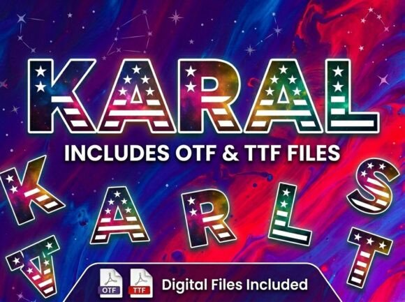
Karal is a high-contrast, expressive display font with strong geometric foundations and subtle artistic flourishes—think confident letterforms with intentional irregularities, balanced weight distribution, and a rhythm that feels both contemporary and timeless. Its personality is bold but not aggressive; artistic but not chaotic. That balance makes it unusually versatile across digital contexts where visual impact meets functional demand.
In practice, Karal excels in moments that need to stop the scroll: hero section headlines, product name treatments, course title banners, and premium brand headers. On a boutique online store, using Karal for the shop name or seasonal campaign banner instantly signals craftsmanship and distinction—especially when paired with a clean, neutral sans serif like Inter or Manrope for body copy and navigation. The contrast reinforces hierarchy: Karal sets the emotional tone; the supporting font handles legibility and flow.
For conversion-focused layouts, Karal works best at scale—1.5rem and up on desktop, 1.25rem minimum on mobile—with generous letter-spacing (0.03em–0.05em) to preserve readability on smaller screens. Avoid cramming it into buttons under 44px tall or tight navigation bars. Instead, reserve it for primary CTAs in hero sections where space allows—like “Start Your Free Trial” or “Explore the Collection”—and pair with a lightweight sans serif for secondary actions. This maintains scannability while preserving Karal’s visual authority.
Readability on dark backgrounds? Karal holds up well—its sturdy stroke contrast ensures definition against deep navy or charcoal. On light overlays over imagery, use a subtle text shadow (1px black at 20% opacity) or a semi-transparent background bar for optimal legibility. Test at 320px width: if letters begin to visually merge or lose character distinction, scale back slightly or increase tracking. Karal isn’t meant for long paragraphs or interface labels—it’s your headline voice, not your utility voice.
Where Karal truly shines is in brand consistency. If you’re launching a creative portfolio site, a wellness coaching platform, or an independent design course, Karal becomes part of the identity architecture—not just decoration. Used consistently across your website header, email banners, social media cover graphics, and downloadable brand kits, it creates instant recognition. That repetition builds trust: users subconsciously associate the font’s confidence and cohesion with your professionalism and attention to detail.
Font pairing matters. Karal pairs naturally with humanist sans serifs (like Nunito or Lato) for friendly, approachable digital products—or with low-contrast serifs (such as Cormorant Garamond or Literata) for editorial-style blogs or premium content sites. Avoid competing decorative fonts; Karal’s strength lies in contrast, not clutter. For multilingual projects, verify that the Karal package includes extended Latin support—most premium versions do, covering accented characters used across Western and Central European languages.
Technical readiness is key. Before licensing, confirm Karal offers WOFF2 files optimized for web delivery, includes at least one weight (Regular or Bold), and supports variable font options if your project demands dynamic typography. Check for stylistic alternates—some display fonts include swash capitals or contextual ligatures that add polish to logo lockups or featured quotes. Also note whether the license permits use across client websites, SaaS platforms, Shopify themes, or digital templates you sell—commercial font licensing varies widely, and using Karal in a Figma UI kit or Notion template requires an extended license, not just a desktop one.
In real-world usage, I’ve seen Karal elevate a yoga studio’s course sales page by anchoring the headline “Breathe Deeper, Move Freer” with grounded elegance—then stepping back for clean, accessible body text. On a micro-SaaS dashboard, it’s been used sparingly for the app name in the top-left corner and feature section headers, creating visual breathing room amid dense data tables. For a handmade ceramics shop, Karal appears only in the logo, Instagram story highlights, and limited-edition product banners—never in pricing tables or filter menus. That restraint is what makes it effective.
Don’t default to Karal for every heading. Use it where intention matters most: the first thing users see, the phrase that defines your offer, the typographic signature that echoes across touchpoints. When deployed thoughtfully—paired correctly, sized responsively, licensed appropriately—it does more than look good. It clarifies purpose, strengthens memory, and quietly communicates quality before a single word is read.
If your current display font feels generic, overused, or tonally misaligned with your brand’s ambition, Karal offers a compelling alternative—one rooted in craft, tested in digital interfaces, and built for designers who treat typography as infrastructure, not afterthought.