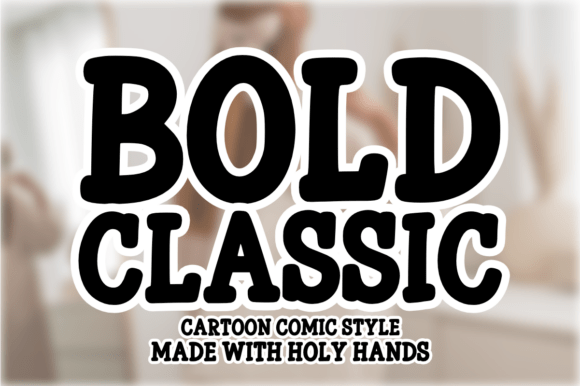
Bold Classic: A High-Impact Display Font for Digital Design
As a web and UI designer, I reach for Bold Classic when I need typography that commands attention without sacrificing clarity. It’s not just another cartoon or comic font—it’s a purpose-built display font engineered for digital impact: thick strokes, confident letterforms, and generous spacing that holds up across devices and contexts. Its personality is energetic but controlled—playful enough for creative brands, bold enough for conversion-focused landing pages.
In practice, Bold Classic excels where visual hierarchy matters most: hero section headlines, product launch banners, CTA buttons, and branded section dividers. Its chunky, high-contrast forms scale cleanly from desktop to mobile, and its open counters improve legibility even at smaller sizes—especially important for responsive navigation labels or app interface accents. Unlike many decorative fonts, it avoids visual noise; every character feels intentional, not chaotic.
Where Bold Classic Delivers Real Digital Value
On a SaaS landing page, Bold Classic transforms “Get Started” into a statement—not just a button, but a promise. Paired with a neutral sans serif like Inter or Open Sans for body copy, it creates instant rhythm: the display font sets tone and urgency, while the supporting type ensures readability and trust.
In an online boutique, it brings warmth and distinction to category headers (“New Arrivals”, “Summer Edit”) without competing with product imagery. On portfolio sites, it anchors project titles with confidence—ideal for designers, illustrators, or photographers who want their work to speak first, and their typography to reinforce voice, not distract.
For coaching websites or digital course sales pages, Bold Classic adds approachability and authority in equal measure. Its cartoon-inspired roots soften formality without undermining professionalism—critical when building credibility with new audiences. Used sparingly (e.g., only for H1s and primary CTAs), it guides the eye toward conversion points while keeping the layout balanced and scannable.
Readability & Responsiveness: Practical Considerations
Bold Classic performs well on both light and dark backgrounds—but test contrast carefully. On dark mode interfaces, avoid pure white; instead, use a soft off-white (#f8f8f8) or brand-aligned accent color to reduce glare. For image overlays, apply subtle text shadows or semi-transparent background bars to ensure legibility without obscuring visuals.
On mobile, reserve Bold Classic for headline-level elements only. At under 24px, its thickness can blur on lower-DPI screens. Instead of shrinking it for subheadings, switch to a clean, highly legible sans serif at 18–20px. This maintains hierarchy while preserving usability.
It’s not ideal for long-form content, navigation menus with many items, or dense data tables. Its strength lies in brevity: short phrases, logos, badges, and callouts. Think “Limited Time Offer”, “Free Guide”, “Join Now”, or “Work With Me”—not paragraph text.
Smart Pairing for Cohesive Digital Identity
The most effective uses of Bold Classic rely on thoughtful pairing. For modern, clean brand experiences, pair it with a geometric sans serif (like Poppins or Montserrat) for body text and UI labels. For editorial or lifestyle sites, try a warm, low-contrast serif (such as Cormorant Garamond or Lora) to add sophistication without clashing.
Avoid pairing with other display fonts, script fonts, or handwritten styles—visual competition dilutes impact. If your brand kit includes a custom logo font, Bold Classic often serves as the perfect secondary display face for web and social assets, reinforcing consistency without redundancy.
Licensing, Formats & Implementation Notes
Bold Classic ships as a premium font with full webfont support: WOFF2 (for optimal loading), WOFF, and variable options if available. Check whether it includes stylistic alternates, multilingual glyphs (Latin Extended-A, basic Cyrillic), or OpenType features like ligatures or case-sensitive forms—these matter for international clients or bilingual sites.
Licensing is straightforward but essential: confirm it covers commercial use across domains, client projects, SaaS dashboards, e-commerce platforms (Shopify, WooCommerce), and digital templates you sell. Most reputable foundries offer perpetual licenses with unlimited domains—just verify usage rights before embedding in production environments.
Real-World Use Cases That Work
- Creative portfolios: Use Bold Classic for project titles over full-bleed images—its weight holds against visual complexity.
- Online stores: Apply it to flash sale banners, limited-edition tags, or “Best Seller” ribbons—never for price text, which needs neutrality.
- Course sales pages: Deploy it for headline variations (“What You’ll Learn”, “Your First Module”) to break monotony and emphasize value.
- Blog headers: Reserve it for featured post titles or newsletter signup prompts—not article bylines or date stamps.
- Brand kits: Include Bold Classic as the designated display face for social media graphics, email headers, and presentation decks.
Ultimately, Bold Classic earns its place in my design toolkit because it solves real problems: cutting through digital clutter, reinforcing brand tone at a glance, and guiding users toward action—without requiring explanation. It’s not about being loud; it’s about being unmistakably clear. When paired intentionally, loaded responsively, and licensed correctly, it becomes more than a font—it becomes part of your digital voice.