Jompy: A Bold, Playful Display Font Worth Trusting
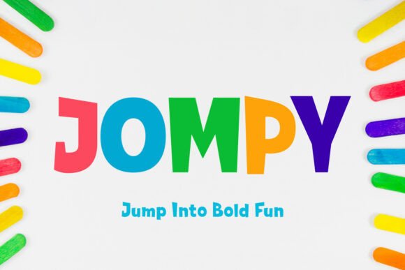
First glance at Jompy feels like walking into a sunlit studio where hand-cut letterforms meet digital precision. It’s not just bold—it’s confidently irregular. The uppercase letters have subtle asymmetry, generous curves, and unexpected weight shifts that give them personality without sacrificing structure. Lowercase feels more relaxed but never sloppy; there’s intention in every curve and terminal. Jompy doesn’t whisper—it leans in, grins, and holds eye contact. It reads as modern typography with warmth, not cold geometry. This isn’t a font for corporate annual reports or legal disclaimers. It’s for brands that want to feel human, memorable, and just a little joyful.
Where Jompy Earns Its Place in Real Projects
In logo design, Jompy shines when the brand voice is approachable, creative, or youth-forward—think indie bakeries, craft studios, wellness collectives, or boutique publishers. Its distinct letterforms create instant recognition, especially in monogram treatments or wordmarks under 30 characters. I’ve used it successfully for a ceramicist’s logo on matte black packaging: the contrast made the type feel tactile, almost sculptural.
For packaging design and product labels, Jompy works best when paired with a neutral sans serif for ingredients or fine print. Its presence on a small soap label or candle jar lid adds premium weight—not because it looks expensive, but because it feels deliberately chosen and well-proportioned. On shelf mockups, it holds attention without shouting over competitors.
In editorial design and blog graphics, Jompy excels as a headline anchor. A single line of Jompy over a muted photo creates immediate visual hierarchy and emotional tone. It’s especially effective in lifestyle or creative-focused publications where tone matters as much as information. For social media graphics, it scales beautifully across Instagram carousels and Pinterest pins—but only when used sparingly. One strong headline, not three stacked lines.
Merchandise and printable design benefit from Jompy’s built-in rhythm. On tote bags or enamel pins, its balanced negative space keeps outlines crisp during screen printing or vector cutting. I’ve tested it in Cricut projects with clean SVG exports—no jagged edges, no hint of pixelation—even at 1.5-inch heights. As a digital product or Canva template asset, it performs reliably across devices when embedded as a web font (WOFF2) or exported as outlined vectors.
Where to Use Jompy—And Where to Pause
Jompy is a display font first and foremost. That means it thrives in large headlines, short phrases, brand marks, quotes, decorative accents, and premium packaging. It also lands powerfully in social posts—especially static quote cards or launch announcements—where brevity and impact matter most.
It should not be used for body copy, navigation menus, or anything requiring sustained reading. Even at 24px on screen, readability drops noticeably beyond two lines. Don’t force it into supporting text or captions. And while it pairs beautifully with clean sans serifs (like Inter or Poppins), avoid stacking it with other display fonts or overly ornate script fonts—that creates visual competition, not harmony.
How Jompy Shapes Perception—and Why That Matters
Typeface choice is silent brand strategy. Jompy signals creativity, authenticity, and lightness—without veering into childishness. In client work, it helps convey “we’re serious about craft, but not stiff about it.” That nuance builds audience trust faster than generic sans serifs ever could. When used consistently across touchpoints—website headers, email banners, printed postcards—it strengthens recognition and reinforces a cohesive brand identity.
But consistency requires discipline. Because Jompy has such strong character, inconsistent sizing, spacing, or color treatment can make a brand feel scattered instead of spirited. I always lock in one primary size range (e.g., 48–96px for web headers, 24–42pt for print) and stick to it. That restraint is what keeps it feeling professional—not quirky for quirk’s sake.
Practical Designer Notes You’ll Actually Use
- Test it in black and white first. Jompy’s charm lives in contrast and form—not color. If it doesn’t pop on grayscale mockups, it won’t earn its place.
- Check small-size readability early. At under 20px, counters close up and legibility suffers. Reserve it for sizes where letterforms breathe.
- Try it on real mockups—not just screens. Print a few variations on uncoated stock or apply it to a 3D packaging render. Jompy’s texture changes with surface and lighting.
- Compare uppercase and lowercase side-by-side. Its uppercase is bolder and more expressive; lowercase is friendlier. Choose based on tone—not habit.
- Review spacing carefully. Default tracking often needs tightening for headlines, especially in all-caps settings. Kerning pairs like “WA”, “To”, and “Fr” deserve individual attention.
- Test font pairing intentionally. Try Jompy beside a sturdy serif (e.g., Playfair Display), a neutral sans (e.g., Lato), a delicate script (e.g., Qanelas Soft), a textured handwritten font (e.g., Bickham Script Pro), and another display font (e.g., Bree Serif). Notice where contrast supports—and where it clashes.
- Confirm commercial licensing before any client or business use. As a premium font, Jompy requires clear usage rights for logos, digital products, and resale assets. Never assume “personal use only” covers your shop, template, or client deliverable.
Jompy isn’t a trend-chasing novelty. It’s a considered, capable display font with staying power—if you respect its boundaries. It won’t solve weak branding, but in the hands of a thoughtful designer, it elevates real work: logos that stick, packaging that invites touch, social posts that stop scrolls, and digital products that feel intentional. Use it where voice matters most. Then step back and let it speak.