Bo: A Display Font That Makes Your Headlines Legendary
It’s 3:47 p.m. on launch day—and I’m squinting at a YouTube thumbnail on my phone. The background is bold, the product shot is crisp, but the headline? It’s blending in. Not standing out. Not *landing*. That’s when I open my fonts folder, scroll past the usual suspects, and click Bo.
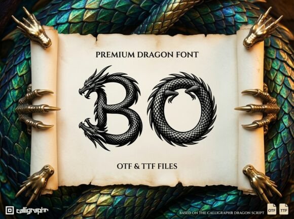
Instantly, the mood shifts. Bo isn’t just another decorative typeface—it’s a premium dragon font, where every glyph feels like it was carved from myth and polished by hand. Think intricate linework, subtle scale-like textures in the serifs, confident curves with ancient gravitas—but never at the cost of legibility. It’s display typography with intention: powerful enough for a hero banner, detailed enough for a collector’s edition drop, and distinct enough that your audience pauses mid-scroll.
We used Bo across a six-week Instagram campaign for a fantasy-themed digital course—think rune-inspired lesson titles, teaser graphics for “Week 3: The Forge of Focus,” and Reels covers with punchy, one-word hooks like Awaken or Claim. On mobile, Bo held its own even at 28px over dark gradients—its high x-height and open counters kept characters clear, while the slight stroke contrast gave visual weight without crowding. No pixelation. No guessing. Just immediate recognition.
Here’s where Bo shines most: short, high-impact text. Not body copy. Not captions. But the first thing people see—the label on a Pinterest pin (“Your Next Ritual Starts Here”), the top line of an email banner (“The Vault Is Open”), the animated title frame in a promo video. It’s built for display—not decoration for decoration’s sake, but display that communicates tone before a single word is read. Its personality is confident, timeless, slightly mystical—but never vague. You don’t need to explain it. You feel it.
We tested Bo in three real contexts:
- YouTube thumbnails: Paired with a tight sans serif (like Inter Bold) for subtitles, Bo handled the main headline—even at 400x225px. Its letterforms stayed sharp, and the subtle dragon-inspired terminals added texture without noise.
- Pinterest pins: Over layered watercolor backgrounds, Bo’s strong vertical stress and generous spacing prevented visual mush. We used it for headline + subhead combos—always keeping the Bo text under 6 words.
- Digital ads (Meta & Google Display): At small sizes, we stuck to uppercase Bo for campaign labels (“SUMMER RITUALS”, “EARLY ACCESS”)—and always paired it with a clean, neutral sans for secondary text. Consistency across ad sets meant our brand voice felt cohesive, not chaotic.
Readability isn’t automatic—it’s intentional. With Bo, we learned fast: avoid tight tracking below 24px. Don’t layer it over busy photos unless you add a subtle drop shadow or solid color overlay. And on light backgrounds? Use the darker weight (if included) or add a hairline stroke for separation. Most importantly—we never used Bo for more than two lines of text. It’s not built for paragraphs. It’s built for presence.
Font pairing is where Bo becomes strategic. We anchored it with Inter for UI elements, email bodies, and caption text—clean, neutral, highly legible. For a more editorial feel (like webinar landing pages), we paired Bo with a warm, low-contrast serif like Cormorant Garamond—letting Bo handle the drama while the serif grounded the message. Never tried it with script or handwritten fonts—too much personality collision. Bo doesn’t whisper. It declares. So it needs breathing room—and a calm counterpart.
Before dropping Bo into client templates or merch mockups, we checked three things: first, the file formats (OTF + WOFF2 for web use, plus stylistic alternates for logo lockups); second, multilingual support (it covers Latin Extended-A, so great for EU campaigns—but no Cyrillic or CJK); third, commercial licensing. Yes, it’s cleared for ads, SaaS dashboards, client decks, and digital product packaging—no hidden restrictions. That peace of mind matters when you’re shipping assets across teams.
We also leaned into Bo’s built-in features: ligatures for “Th”, “Fi”, and “Fl” added polish to branded quotes; the alternate “Q” and “R” gave us flexibility for logo-style treatment in story highlights; and the range of weights (Light, Regular, Bold, Black) let us create hierarchy without switching fonts. One family. Multiple voices.
What surprised us most wasn’t how Bo looked—it was how it behaved in real workflows. It reduced revision rounds. Clients didn’t ask “Can we make the headline bolder?” because Bo already carried weight. Social teams reported higher engagement on posts where Bo appeared in the first frame—not because of magic, but because it signaled *this matters* before the eye even registered the words.
That’s the quiet power of a well-chosen display font. It doesn’t replace strategy. It accelerates it. Bo doesn’t shout—it commands attention with craft, clarity, and quiet confidence. Whether you’re designing a limited-edition shop banner, prepping a webinar series, or building a content library for a new brand identity, Bo gives your message a visual signature that sticks—not because it’s flashy, but because it’s memorable on purpose.
So next time you’re staring at a blank canvas, wondering how to make “New Collection Live” feel less like an announcement and more like an invitation—open Bo. Then step back. Let the type do the talking.